Pages

Showing posts with label nail art. Show all posts

Friday, 7 March 2014

Morgan Taylor 'Little Misfit' Swatches & Review + Nail Art

* Product provided for review

Hello again! Today I'm reviewing the second polish I received from Morgan Taylor's Glam Rock collection, 'Little Misfit'*. If you missed 'Polished Up Punk', you can see it here, along with some information about the collection and the brand.

Before I start, I want to forewarn you that some of these photos are rather...unflattering. This polish was a rascal to photograph and I ended up contorting my hand into weird positions to try to capture it as best I could. 'Little Misfit' is described by Morgan Taylor as a 'Lavender and Aqua Duo-chrome' and it looks like this...


Monday, 3 March 2014

Morgan Taylor 'Polished Up Punk' Swatches & Review + Nail Art


* Product provided for review


Hello! I know I sound like a record stuck on repeat, but apologies yet again for being so absent. I've been away from home so much over the past month it feels like I've hardly been here...but things have settled down now, so here I am!

I was delighted to be contacted by Morgan Taylor recently and asked to review a couple of polishes from their 'Glam Rock' collection (which I believe was for Winter 2014). The Glam Rock collection is described as 'A mixture of funky metallic shades and glitters to bring out the rebel in you!' and consists of six polishes:


Left to right, they are:
Better in Leather – Black silver glitter
Little Misfit – Lavender and aqua duo chrome
Polished Up Punk - Navy crème
Pretty Wild – Lavender greige crème 
Rebel With A Cause – Deep burgundy pearl
Studs and Stilettos – Gunmetal glitter

If you're not familiar with the Morgan Taylor brand, here's a little blurb from the company:

'Morgan Taylor has been created by Gelish founders Danny Haile and David Daniel. The specialist formula is made from raw ingredients enhances finish, coverage and wear ensuring that not only your nails will look gorgeous but they will stay that way too!RRP £10.99 each from Sallyexpress.com'

The polish I'm showing you today is the navy crème, 'Polished Up Punk'*.  I also received 'Little Misfit', the duochrome, so expect to see that one at some point in the near future!


'Polished Up Punk', two coats plus top coat

'Polished Up Punk' is a dark navy which appears blackened in some lights, but remains just on the right side of black - by which I mean that it is almost always discernibly blue and not black. I think its depth is more apparent in the nail art photos below. It's a very winter-appropriate colour and I always think these kinds of shades look especially foxy on short nails. I found the formula very nice: it was neither too runny nor too thick, spread smoothly and had great opacity - I used two coats plus top coat here, but you could conceivably get away with one if you were careful. I also really liked the shape of the brush, which is flat but not too wide (I know a lot of people can't stand super-wide brushes) and a sensible length. Please excuse the slight scuff marks in the above photos - my goopy top coat was responsible, not the polish itself! I didn't wear this manicure long enough to comment authoritatively on wear time, but I wouldn't expect any problems if worn with a good top coat.

Aaand I wouldn't feel like I was blogging properly if I didn't throw in some nail art, so...

Saturday, 25 January 2014

Burns' Night Nail Art/BPS Striping Tape Review

Hi friends! Just a quick post from me tonight - some Scottish-y themed nail art for Burns' Night and a wee review of this striping tape from Born Pretty Store. (Discount code at the bottom of the post, too!)


Tuesday, 14 January 2014

Baroque 'n' Roll | Nail Art

Bahahaha. Yes, that excruciating pun did just happen. I'm not even going to apologise for it.

Hello and Happy New Year! How I've missed my wee blog. November and December were really rather busy months for me and I ended up being away from home quite a bit, so sadly nail art had to take a back seat. I'd say it was a pretty productive time, though, and I'm looking forward to what 2014 will bring... I hope it will be a joyful, prosperous year for you all. :)

Nail art!


Friday, 30 August 2013

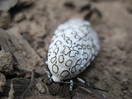
Giant Leopard Moth Print | Nail Art

Today I am bringing you the hot new thang in animal print trends: Giant Leopard Moth print! Leopard print was, like, so 2012. Or something. Whatever.


In the (ahem) off chance that you are not familiar with the Giant Leopard Moth:


Source: http://biologie-me.blogspot.co.uk/2010/02/buggin-out-on-thursdays-giant-leopard.html


I pinned this image to my nail inspiration board on Pinterest (which I occasionally remember to use) aaages ago, so I'm glad I finally got round to making use of it!

I almost regretted beginning this design because it meant starting with a white base, which is always a pain in the backside. However, I used Sally Hansen Complete Salon Manicure in 'Ivory Skull' this time around and it was kind of okay. I mean, it's a bit sheer and streaky and if I looked veeery closely, imperfections were sometimes visible even at three coats in certain, but the formula itself wasn't difficult to use. 


After much deliberation, I added one coat of Essie 'Pure Pearlfection'. It's a silver-ish shimmer top coat, but if you look closely you can see that the individual particles have a green/pink iridescence. It's pretty subtle in person, but even more so on camera. It showed up best in underexposed images...I hope these prove that the shimmer actually exists!


I thought the random piece of paper in the background really added something...


I added the 'spots' using a super skinny cut-down brush. I had planned to use my Model's Own x WAH nail art pen, which I've tested on paper but never yet used on my nails, but when I attempted a trial run (again on paper) it seemed to have gone very watery. Not cool. If you've had a similar issue and have any suggestions, do let me know! 

I left these shiny for about a day but added ELF's matte top coat while I was taking my photos and I think I prefer them this way. It seems to help the shimmer come out to play, too. ELF's isn't the matte-est matte top coat I've seen and it doesn't stay matte especially long, but it isn't bad for the price.


Shiny/Zombie hands

Matte


So, what do you think? Did I make the right decision in adding the shimmer? Are you a shiny or a matte person? I do like this design since it's quite striking and unusual, but now I want COLOUR, so I don't think they'll last very long!

When Giant Leopard Moth print starts popping up on the catwalks, just remember that you saw it here first... ;)

Tuesday, 6 August 2013

Tropical Flowers feat. Color Club Fiesta Collection

Hello lovelies!  Just a quick post from me since I had intended to be in bed hours ago (though such is the case more or less every night, haha).  I was actually in two minds about whether or not to post these at all - although I really like them in person, I'm not entirely happy with how the photos turned out.  You're getting them anyway!


I was rather so excited to come across the Color Club Fiesta Collection in TK Maxx last week - other people always seem to find bargains there but this was my first, which made it kind of irresistible...though the colours are nice too, haha.  This design made use of Endless Summer - blue, Sunrise Canyon - chartreuse (or at least, that's what I would call it) and Wild Cactus - green.  These pictures aren't perfectly colour-accurate, to my eye: I'd say Endless Summer is a touch darker and bolder (I found it to dry noticeably darker than the bottle colour, which was disappointing, though it's still nice) and Wild Cactus a bit deeper/greener and less teal-y.  

The idea for the leafy nails popped into my head whilst watching this MrCandiipants tutorial - although I'm not sure if it will be obvious why...  Of course, I couldn't do without an accent nail or two and flowers seemed the natural accompaniment.  Originally, I had used the pink polish in the same collection (Flamingo) for the flowers on a base of Endless Summer, but I took those off and much prefer them this way!


I enjoy the fun, summery vibe I get from these, despite the fact that our weather remains rather...Scottish.  What do you think?  Do you feel my viiibe?!  Haha.  This post was definitely longer than I intended...  Good night!

P.S. Yep, changed my nail shape again.  I am fickle.

Monday, 29 July 2013

piCture pOlish Blog Fest 2013

Celebrating the Year of the Blogger!


HIYA POLISHED PALS!  Can you tell I'm excited?!  I'M EXCITED.  I was utterly over the moon when I received the email inviting me to take part in piCture pOlish Blog Fest 2013, not least because I had never had the opportunity to try their polishes before.  For those unfamiliar with Blog Fest, it is an annual event run by PP and involving bloggers from all around the world and this year, Blog Fest is celebrating amazing nail art.  Three lucky participants will also be chosen to create a PP collaboration shade each, for release in 2014.  The voting will take place on PP's special Blog Fest 2013 Pinterest board - if you'd like to see the other entries and take part in the voting, you can find that here: http://pinterest.com/picturepolish/

I was sent these three shades to play with:


Ocean - 'An octopus garden in the shade...'
Ruby Blou - 'Dazzling red, sparkling blue'
Atomic - ' WARNING...totally explosive!'

As you can see, Ocean and Atomic were created by Kelly's Kolors and Samarium's Swatches respectively - I hope I've done their beautiful creations justice!  So without further ado, here is my contribution to Blog Fest 2013!


Ta daaah!  Being so used to working with cremes, I was initially unsure how best to show off these three shades, but I am pleased with how they turned out.   If you'd like to recreate the look, you're in luck, because here is my FIRST EVER TUTORIAL!


1: After applying base coat, paint your base colour - this is three thin coats of Atomic.
2: Using a nail art brush - or the bottle brush, if you're so inclined - paint the shapes of your flowers.*
3: Outline your flowers in black, using a nail art brush or pen, then frame the rest of your nail (which I forgot to take a picture of, oops).  Don't frame the parts where the flowers are!
4: Glitter placement - plop some Ruby Blou on a bit of paper/tin foil and use a toothpick/dotting tool/weapon of choice to pick up individual pieces of glitter and arrange them roughly to form the centres of your flowers.
5: Add top coat & clean up if necessary, and you're done!
*When I used Ruby Blou as a base, I painted the flowers in black and added Atomic over the top afterwards.

The polishes themselves are really beautiful.  Ocean is super sparkly with holo-ish flakes in a turquoise jelly base.  It is quite sheer but the formula is lovely, so it truly isn't a hassle to layer it up.  Ruby Blou is a delightful mix of large and small hex (I think) glitters in red, blue and silver, suspended in a clear base.  Atomic isn't something I would necessarily have thought of as a 'me' colour, but it really is incredibly gorgeous and so complex.  The base is a silvery white shimmery affair, but there are loads of little flakes in there too - I see pink and green and gold reflections and sparkles.  I've included some bottle photos especially to try to capture some of the more complex elements of Ocean and Atomic.


Pretty special, right?  


What do you think?  Are you a piCture pOlish fan?  I'm certainly impressed!  You can find PP's polishes on their website or at one of their worldwide distributors.  If you're in the UK (& perhaps Europe?) you can find piCture pOlish at the wonderful Sally Magpies.  

HAPPY BLOG FEST 2013 EVERYONE!  I can't wait to check out all the other bloggers!

 pOlish On-line Store     Facebook     Twitter     Pinterest     Instagram


EDIT: Now you can check out some of the other BlogFesters' posts below and add your own, if you haven't already!


Thursday, 6 June 2013

Neon Skittle Nail Art feat. Illamasqua Collide & Gamma

Remember last time I talked about how difficult Nubar Violet Sparkle was to capture on camera?  Neons are even more elusive!  I need to stop doing this to myself, haha.  Enter Illamasqua Collide (pink) & Gamma (orange).


They do look relatively glowy here but the colours aren't perfectly accurate - Collide is hotter in person and Gamma possibly looks a little softer or peachier?  I think the orange overpowers the pink a little in these pictures.  Here is a really attractive 'phone photo:


Collide looks more like this most of the time - the 'true' colours (shining throoough) are probably somewhere in the middle and probably more neon.  Also, you can see the effect on my middle finger much more clearly here.

SO.  I had originally painted my nails white with the intention of trying out the 'watercolour' technique but it wasn't exactly working for me so I've shelved that for the time being.  I didn't want the effort of painting my nails white to go to waste, though, so neon seemed like the natural choice!


Awkward thumb, hello to you!


This was more or less a 'make it up as I go along' affair.  Index to pinkie we have: neon clouds; saran wrap technique (I think I first learned this from Chelsea's tutorial but there are others out there, too); some funky lines; and a psychedelic swirly thing which makes me think of lollipops.  Some excellent naming there.  My thumb echoes my ring finger but runs horizontally rather than vertically.  I painted everything (except my middle finger) using little brushes.  The outlines are Barry M Gold Foil, which is a go-to nail art polish for me; and the studs are from this set by BornPretty, stuck on with a blob of top coat and sealed with layer of the same.


I really love this combo - it's so fun and happy!  I just wish (again) that it was easier to photograph.

What do you think?  Will you be sporting some feisty neons this summer?

Monday, 22 April 2013

Feelin' Hot Hot Hot | Chilli Pepper Nail Art

...So we can rum boom boom boom!  


Hiya!  Getting all spicy with this hot little chilli (or 'chili' for my American friends) number!  

I honestly have no explanation for how this happened.  I had intended to do something entirely different but it just didn't work out quite exactly as I wanted and then this idea just popped into my head.  I'm really glad it did.  These nails are pretty different (I think) from most of things I've done before, but I think they're rather cute & fun.  I like them!

[An aside: do you get yellow chillis?  If not, those ones are just ordinary peppers...] 


I started with a white base (always a joy...) then painted the pepper-y shapes in Kikos 236 & 239 (lighter & darker reds, respectively), Barielle 'Lemondrops' and Sinful Colors 'Exotic Green'.  I added the stalks with Sinful Colors 'Last Chance' and then outlined & detailed with a skinny brush using a black Orly (Liquid Leather?).

Overall, I'm really happy with these.  I wanted them kind of 'arty' looking and they might be a bit too 'sketchy' in places and insufficiently so in others but I think it's a relatively forgiving design in that regard.  I also wonder if it might have been better with the chillis 'peppered' about (BOOM) a little more sparsely; if you try it, make sure you take into account the stalks & outlining when spacing your chillis!


If you've been following my nails for a little while, you may have noticed that I've changed my nail shape; I fancied a wee change & I'd broken corners off a couple of nails on my other hand, so the time seemed ripe.  I quite like them when they're painted but they do look a bit odd to me when they're not!  What do you think?  Does it suit me?  Is there another shape I should experiment with?  I'll almost definitely end up back with my trusty squares sooner or later...


Final thought: I think a print similar to this could be really cute for summer skirts/shorts/dresses...then you'd be looking HOT (and again!) all the time!  What do you think?  Could peppers be the new bananas?  Chilli jokes appreciated.

Hope you've had a top notch weekend.  I leave you with this:


Monday, 8 April 2013

Zig Zags/Floral Tribal Mish Mash

Hello!  I'm back!  We had a very busy (in a good way!) Easter weekend last weekend but I have now had a chance to paint my nails & take photos etc. soooo yay!  Nails!  


I think this looks kind of like an Easter manicure (cute colours + zig zags = Easter?) but that really wasn't my intention!  Guess I still have Easter on my subconscious brain.  I started out with base colours of China Glaze 'Re-Fresh Mint' & Color Club 'Sweet Pea'.  I hadn't really decided in advance what I would do next, but zig zags just seemed an appropriate choice!  For the other nails, I was going for a tribal-esque vibe, but with little flowers instead of dots (am I still making sense?!).


I picked out Essie 'Blanc', Barry M 'Blackberry' Gelly (the purple one) & Barry M 'Gold Foil' (which I use a LOT for nail art) and added the details with some striper brushes and my second smallest dotting tool.  It was starting to get dark when I painted these so I rushed them a little, but thankfully I don't mind the 'hand painted' look, haha.


I was pretty disappointed with these at first - I absolutely love Re-Fresh Mint & Sweet Pea together and I think I felt that the busyness of the design kind of detracted from that.  They have definitely grown on me, though.  What do you think?


Got some bonus Easter photos for you, too!


Heilan' Coo


The top photo is of some nails I did for the delightful Maddy while she and my sister, Alison, were up staying with us over Easter.  I think nail art looks super cute on wee nails.

The bottom photo is of a heilan' coo (highland cow) at Pollock Country Park because HIGHLAND COWS ARE AWESOME.  Seriously, so cute, I love them.  This one is a 'baby' - look at its little teeny tiny horns just starting to poke out!

Hope you enjoyed these little extras & that you all had as splendid an Easter as I did!  As always, I'd love to hear your thoughts.

Tuesday, 26 March 2013

Illamasqua Jo'Mina Debut | Stripy Geometric Mix

Hiya!  I'd fancied picking up Illamasqua's Jo'Mina for a good while, having seen/read so many complimentary things about it on various blogs.  Finally I caved and nabbed it from eBay (for slightly cheaper than normal) last week, thanks in part to the absolutely lovely Kayla Shevonne who was kind enough to send me a bottle-shot comparison to help me decide whether I 'needed' it (haha).

I was really keen to use it but didn't have a clear idea of what I wanted to do, so in the end I just picked out a couple of colours I thought would complement it and got to painting!  Here is the result:


Nail art in mix & match geometric/striped patterns, with Illamasqua Jo'Mina, Barry M Shocking Pink & 17 Smokey Marble


I'm generally a wee bit apprehensive about beginning a design without knowing what I'm going to do (it doesn't always end amicably!) but I'm pretty pleased with how these turned out.  I think the skinniest stripes, which I included on each nail, pulled the different designs together quite neatly, along with the framing.  I still find lines a bit tricky at times and I know a few of them are a bit wonky, but not too badly (I don't think?!).  I totally dig bold, geometric-esque mix & match designs, although it's not something I do often.  


Nail art in mix & match geometric/striped designs, with Illamasqua Jo'Mina, Barry M Shocking Pink & 17 Smokey Marble


Nail art in mix & match geometric and striped designs, with Illamasqua Jo'Mina, Barry M Shocking Pink & 17 Smokey Marble


Illamasqua Jo'Mina is a fantastic purple.  It's more intense (and possibly a touch pinker, I'm not sure) in person.  Here I've matched it up with Barry M Shocking Pink and 17 (by Boots) Smokey Marble.  (It's spelt 'Smokey' with an 'e' on the bottle, though I don't know why!)  I really wanted to use something other than my go-to black or gold as the offset/outline colour and I think Smokey Marble was a good choice here.  It's a bit darker than it looks in the bottle - I think I'd call it 'gunmetal' - and the shimmer is pretty subtle, but I think it makes a nice change!


Nail art in mix & match geometric and striped patterns with Illamasqua Jo'Mina, Barry M Shocking Pink & 17 Smokey Marble


Nail art in mix & match geometric and striped designs, using Illamasqua Jo'Mina, Barry M Shocking Pink & 17 Smokey Marble


For my index and pinkie fingers, I found it easiest to paint the pink and purple first, then add the darker, thinner lines at the end.  After having to redo my ring finger, I decided it was best to outline the patterns on the remaining nails, fill them in, then tidy up the lines where necessary.  I mostly used striping brushes (in a variety of lengths, so I didn't have to clean them constantly!) for this design, including my super cut-down brush for the skinny lines.


Nail art in various bold geometric designs with stripes, using Illamasqua Jo'Mina, Barry M Shocking Pink & 17 Smokey Marble


What do you think?  Are you a fan of mixing-and-matching?  Do you have a favourite finger?  (I realise that last question sounds kind of creepy.)

Wednesday, 20 March 2013

Jan Weiss 'Yellow Petals' Inspired Nail Art


Hello!  Rocking some 'art-inspired' nail art right now:


I'm hardly what you'd call an art buff - although I wish I was more knowledgeable in the subject - but I found myself browsing art.com for inspiration, where I came across this Jan Weiss print, 'Yellow Petals 4':


I absolutely loved it - it was just begging to be made into a manicure!  I'm always trying to convince myself that floral designs are 'too girlie' for me, but every time I do something flowery I end up really liking it.   What I dig about this series of Jan Weiss prints, I think, is that they're a bit 'edgier' (seriously judging myself for using that word) than my idea of a more classic floral, and not very cutesy at all!  I love the freshness of the colours, too.


I began this design by painting my nails white.  Whilst I love nail art on a white base, I do NOT enjoy the act of painting it.  White polish just seems to be consistently annoying, so if you have one you love, let me know!  

I used Barry M 'Acid Yellow' for the outer colour of the petals, which I just painted using the brush in the bottle.  Then I added the accent colours with a little brush, in Barielle 'Lemondrops' and Illamasqua 'Blow'.  After that, I went in with my smallest dotting tool to try to replicate the 'dotty' look of the petals round the outside at and the borders between the different colours, but that's really not apparent in the finished look unless you go eyeball-to-nail, so I probably wouldn't bother if I did it again!


Next, I added dots on the petals using Sinful Colors 'Exotic Green', and more in the centre with Barielle 'Sweet Addiction' and Sinful 'Last Chance'.  Up until this point I thought my flowers looked a bit daft and I really didn't think they were going to work!  However, the addition of the black lines (with a cut down striper) finally pulled the look together.


I did have a couple of ideas for the rest of my fingers, but I felt anything I put on them might detract from the impact of the flowers.  At first I thought they looked a bit stark or incomplete but actually,  I really like the clean aesthetic of the white next to the bolder, fresh-coloured flowers.  Despite the fact that it has been snowing here for about a week, I do love how springy these feel!


What do you think?  Are florals your thing?  And if you have any white polish recommendations, do let me know!