Pages

Friday, 8 November 2013

Neutral Leopard, Popping Neon | BornPretty Fluorescent Studs Review & Nail Art

Hi friends! Apologies for the extended absence. I'm back with another review for BornPrettyStore.com, this time for these fluorescent studs. I'm sure I've mentioned before that I've always been impressed by BornPretty's value and service, so I won't rehash all that. You'll find a 10% discount code at the bottom of this post (and also in my sidebar).

On to the fun stuff! Here's the nail art/inspiration combo:


It's possible to draw inspiration from what is, in essence, an advert - who knew?! 

So, the studs. I like them a lot. There are are 2mm squares and circles in each of six colours. The first thing I have to point out is that they are waaay brighter than the above photo shows - my camera refuses to accept that neons (or at least pink ones) exist. My 'phone camera kind of likes them though, so you can enjoy this fuzzy delight:


I'd say that's relatively colour-accurate (if not quite perfect). The product page says there are 400-ish in the box; I'm not going to count them, but there seem to be plenty. In case you're interested, that would work out at approximately 67 per section if evenly divided. Do with that information what you will.

For me, 2mm is an ideal size for studs and so on - I generally don't like my decorations too big. The backs are hollow and I found them pretty easy to apply: plop a dot of top coat (or glue) on the nail where you want the stud to be (I use a toothpick), pick up stud with a moistened orange stick (or alternative), place it where you want it; you'll have a little time to get the placement perfect before your adhesive dries. I use a top coat over the entire nail to seal everything in and I had no problems with the colour on the studs running or anything like that. The sides of the studs do stick up a little and there's a gap before the colour starts (i.e. the sides of the studs are silver) but if you're used to wearing studs, I don't think you'll notice it at all; and if you're not, you'll soon acclimatise! 


Also a 'phone photo - sorry!

As to longevity, I think you can expect these studs to last a good few days, at least. I did lose a couple within the first day or so, but as they were both from the same finger, I'm pretty sure that was top-coat error on my part. After a few days, I seem to have scuffed some of the colour off the top of a few studs; I'm not sure what caused it, though (there's a chance I did it with a buffer) so that might be might fault, too. I think you might be able to reuse these if you're super careful when you remove them, but my (limited) experience is that it can be tricky to get all the polish off them without stripping the neon colour, too, so it probably isn't worth the hassle.


I appear to have run out of photos, so just a brief overview of the nail art itself. Base is three coats of Sally Hansen Complete Salon Manicure in Crinoline (not a 'me' colour at all, but I love it); spots are Barry M Lychee Gelly with a teensy bit of Nails Inc Fenchurch Street mixed in; black is Orly's Liquid Vinyl. For the leopard print, I used a dabbing motion with a little brush. I used a dotting tool for the cross on my middle finger and there are some 1.5mm black rhinestones on there, too, which you can barely see.

I haven't worn leopard print in what feels like forever - I think I worry it might be perceived as 'boring' - but I kind of love it! I've seen so many great leopard colour combos lately, too. Also really digging the neon pop against the neutral background. My only qualm (with my nail art, not the studs) is that I occasionally feel I've created a leopard with chicken pox...

As always, I'd love to hear what you think in the comments and if there's anything else you'd like to know, feel free to ask. And finally:

DISCOUNT CODE

Saturday, 12 October 2013

Blue & Black Splodges/Cow Print | Nail Art

Holaaa! Another winner of a post title... We're off to Spain for a week tomorrow (well, tonight) so I really should be doing something sensible, like packing. But here I am! I painted these nails last night and I like them a lot - they were really quick today and I have such a thing for blue & black at the moment. I think they look a bit like very funky cow print nails, though I didn't strictly go in with that in mind, haha.


The blue is Kiko 336 - basically a dupe of Nails Inc Baker Street (which I don't own) and all those like it. LOVE this kind of electric blue and I really hope it never goes out of fashion!


Must dash! Have a splendid week!

Sunday, 6 October 2013

Mini Messy Floral Mani | Nail Art

Hi friends! I've been busier than usual lately but happily, I now have some new nail art for you. Hooray! I feel I should warn you upfront, though, that my photos are somewhat inconsistent - I decided to take them next to my window but it was one of those days where the light changes from one second to the next, so I ended up with a real variety of colours and brightnesses haha.


Aaand here's a close-up of the H&M dress I based them on (which I have had for years):


I'm so so pleased with how these turned out - they're really cute but the loose-ish interpretation of the flowers keeps them from feeling cutesy. I didn't reproduce the fabric pattern precisely, but I hope you'll agree that these capture the sense of the dress nicely. 


I used Barry M 'Passion Fruit' (from the Gelly line) as my base colour. I picked this up just last week and I'm so glad I did. My pictures don't do it justice but it is a fantastic shade - a really bright, coral-y red (not the orange my camera seemed to think it was!). The white detailing was added with a cut-down brush; I used a kind of dabbing/blobbing technique for some of the smaller flower petals. 

These nails were relatively simple to do, perhaps deceptively so: since the pattern is quite messy and haphazard, your flowers shouldn't be too perfect, so you can be quite freehanded about it and no one will know if you make a 'mistake'. I did a couple of matching accent nails on my other hand and they broadly match, even if they're a touch more 'abstract'. ;)


What do you think about these? Do you enjoy this kind of floral? Also, if you've been following for a wee while, you might have noticed that I've had (another) file-a-thon, haha, so feel free to let me know how you feel about this nail shape, too (I really like it, for now)!

Thursday, 19 September 2013

Blue 'Ikat Beach Tote' Nail Art

Hihi! This is really going to be a quick post because I'm really going to go to bed. Honest.


These nails were inspired by this beach tote bag which appeared as an a sidebar ad during a recent blog-reading spate - who'd have thought there was inspiration to be found in internet adverts?! If you have a better name for this design, let me know!

I began with a base of Sally Hansen Complete Salon Manicure 'Thinking of Blue' (two coats), which I love. It has a slight dustiness, but also a certain richness and perhaps the littlest hint of 'blurple'. I really like the CSM brush, too (although you can get wonky ones) - flat and quite broad with a rounded tip which fits my cuticles nicely. I added the white pattern with a nail art brush and finished off with the teal detailing, using A England 'Galahad'. If you've been reading my blog from the start, you'll know I love A England and Galahad is another delight - sometimes he looks dusty and sometimes bright, but always beautiful.


It would have been nice to be able to fit a little more of the original pattern onto my nails, but I had to enlarge individual elements of it in order to give Galahad a fair showing. I am very pleased with this design, but I felt a little let down by my execution - I was just having one of those nights where nothing would behave as I wanted it to! Still, I think it looks quite lovely in person since the imperfections are less noticeable when I'm not inspecting them microscopically!


Owning the awkward thumb. 

So, what do you think? Do you dig the design? What about the bag itself? Apart from anything else, I think these colours make a really great pair - even if I need to get back to practising my freehand skills. My index finger with the little diamond is probably my favourite - how about you?

Hope you're all well - not long 'til the weekend...!

Thursday, 12 September 2013

Seventeen Cameo Crush Textured Polish | Swatch & Review

Hiiii! I know, I 'don't do' swatch posts...but today I do! 


I had no idea that Boots' own brand Seventeen (or 17, whichever you prefer) was even making textured polishes. I had been planning on picking up one or two of the GOSH ones until I happened to spot these while waiting on a prescription.  Boy, am I glad I did!


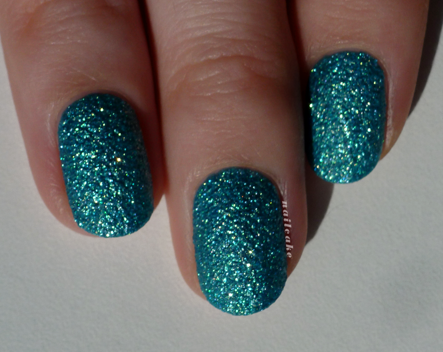
Seventeen Rock Hard Couture Nail Effects in Cameo Crush (mouthful!) is a turquoise-based matte textured polish with an insane quantity of golden sparkle and also (I think) some holographic or at least iridescent sparkle, too. It was impossible to capture the true beauty of Cameo Crush on camera but please trust me when I tell you it's a mega GLITTERBOMB and utterly gorgeous. I'm not entirely au fait with the plethora of textured polishes available, but this one seems unique to me! I can sum up how this polish made me feel in two words: mermaid princess. Seriously.


Formula & Application: Dreamy! It may seem a little thick if you are used to applying very thin coats, presumably due to all the particles in it, but I found it incredibly easy to control. These pictures show two coats and next to no clean-up, even on my 'other' hand - massive bonus! In terms of opacity, you could probably get away with one thick coat, but two definitely looks better - the sparkle is intensified and you get an even distribution of texture. The brush is flat, quite small and nicely pliable - no complaints! 

I waited a good ten or fifteen minutes between my coats. I don't know if that was strictly necessary but it seemed to work well. My second coat tended to be thicker so it could glide over the already-textured nail and seemed to take a little longer to dry. If you haven't used textured polishes before (I hadn't), watching them dry is a fascinating thing. At first stroke, this seems like a fairly ordinary glittery polish, shiny and not textured at all. When it's half-way dry it develops some texture and also a metallic sort of 'sheen' - I was glad it didn't stop there! As it dries down completely, it becomes matte and the texture and sparkle come into their own. The shade also appears a little lighter when dry.


Removal: More difficult than a crème polish, but nothing like an all-out glitter. Really it just requires a little patience. I might consider using foil in the future, at least in part to try to avoid getting glitter particles all over my hands, haha. I had half expected some staining given the colour, but if there was any at all it was minimal and easily removed by a little scrubbing with a nail brush.


Blurry sparkles!


These Rock Hard Couture polishes are priced at £3.99 each and are currently buy one get one half price. The other shades are a gold called 'Charm Bracelet' (which I'm wearing right now) and an iridescent white ('Celestial Pearl' - next on my list) and a pink with gold sparkle ('Bijoux Baby').

Overall, I'm absolutely blown away by this polish. I was a texture-sceptic, but I have been converted! I'm delighted that the British high street has come up with such a high quality alternative to brands which are more difficult and expensive to get hold of in the UK; and in particular that they've produced some original shades. I really hope these polishes get the attention they deserve and that Seventeen makes more colours! I know I'm going to be hassling them to...


So, how was my first swatch post? Did I cover everything you might want to know? Do you love this polish like I do? Please also let me know if you'd be happy to see more swatch posts - it's not something I envision doing a great deal of, but occasionally I come across something I love enough to want to share! 

Friday, 30 August 2013

Giant Leopard Moth Print | Nail Art

Today I am bringing you the hot new thang in animal print trends: Giant Leopard Moth print! Leopard print was, like, so 2012. Or something. Whatever.


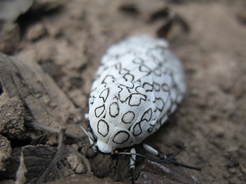
In the (ahem) off chance that you are not familiar with the Giant Leopard Moth:


Source: http://biologie-me.blogspot.co.uk/2010/02/buggin-out-on-thursdays-giant-leopard.html


I pinned this image to my nail inspiration board on Pinterest (which I occasionally remember to use) aaages ago, so I'm glad I finally got round to making use of it!

I almost regretted beginning this design because it meant starting with a white base, which is always a pain in the backside. However, I used Sally Hansen Complete Salon Manicure in 'Ivory Skull' this time around and it was kind of okay. I mean, it's a bit sheer and streaky and if I looked veeery closely, imperfections were sometimes visible even at three coats in certain, but the formula itself wasn't difficult to use. 


After much deliberation, I added one coat of Essie 'Pure Pearlfection'. It's a silver-ish shimmer top coat, but if you look closely you can see that the individual particles have a green/pink iridescence. It's pretty subtle in person, but even more so on camera. It showed up best in underexposed images...I hope these prove that the shimmer actually exists!


I thought the random piece of paper in the background really added something...


I added the 'spots' using a super skinny cut-down brush. I had planned to use my Model's Own x WAH nail art pen, which I've tested on paper but never yet used on my nails, but when I attempted a trial run (again on paper) it seemed to have gone very watery. Not cool. If you've had a similar issue and have any suggestions, do let me know! 

I left these shiny for about a day but added ELF's matte top coat while I was taking my photos and I think I prefer them this way. It seems to help the shimmer come out to play, too. ELF's isn't the matte-est matte top coat I've seen and it doesn't stay matte especially long, but it isn't bad for the price.


Shiny/Zombie hands

Matte


So, what do you think? Did I make the right decision in adding the shimmer? Are you a shiny or a matte person? I do like this design since it's quite striking and unusual, but now I want COLOUR, so I don't think they'll last very long!

When Giant Leopard Moth print starts popping up on the catwalks, just remember that you saw it here first... ;)

Sunday, 25 August 2013

Despicable Me 2 | Minions Nail Art

Hi friends! I had no plans for Minion nails but we're fiiinally going to see Despicable Me 2 tomorrow and I was wearing yellow already, so it was clearly FATE. I'm not really going to say anything about these since so many other people have done them already, but feel free to ask away if there's anything you'd like to know. YAY MINIONS!


The yellow is Illamasqua 'Blow' (hahaha) & the blue is Kiko 385 (which is amaaazing). (Silver is Color Club 'On the Rocks' and the brown is Nails Inc 'Fenchurch Street'.)

Do you love Minions? (If not, who ARE you?!) Hope you're enjoying a lovely weekend!